The Process
The pre-process
Observation + Empathy throughout
Watch what your users are doing & try to feel what they feel.
Pre-process: Take a deep breath and enjoy observing users.
Step 1 | What is the problem?
If we know what it is already - analyze it & confirm that this is really the problem we should be trying to solve.
Create a clear problem statement that is user-centered, allows for creative freedom but is narrow enough to be feasible.
Step 2 | Research
What has been done before? What worked, what didn’t work. Look at theories of behavior that apply to current users. Benchmarking, scientific articles, blogs, interviews or ethnographic research...depending on what's needed.
At this stage all the technical, business, marketing and content requirements need to be discussed. The content creators are literally the KINGS and QUEENS of the experience. Great content provides structure, emotion and usability.
Step 3 | User Personas
Collect and analyze information from your users during interviews to create your average user as well as extreme users. How deep you go into analyzing types of users will depend on the amount of time you have. I prefer to create user personas through interviews ethnographic research and shadow very different characters (a day in the life).
Step 4 | Brainstorming & Ideation
That amazing day when you can start forming ideas from your collection of insights (screenshots, post-its, and bookmarks) My master’s thesis was about the effectiveness of brainstorming so I spent 6 months in the depths of how to elicit the highest number of high-quality ideas from one 45-minute session.
Techniques:
- How might we... method
- Anonymous brainstorming
- Individual pre-brainstorming
- Empathic exercise as a start.
Step 5: Quickly sketch out ideas.
Step 5 | Pen to Paper
Seeing is believing. Those first strokes of pencil on paper to visualize the ideas generated in step-4. Paper prototyping is important to me as a designer because it can quickly communicate dozens of ideas without being fidgety. And it's a lot of fun to do with everyone at a company. Everyone can be a designer here :)
Evaluate and redraw until your evaluations lead you to 3 options.
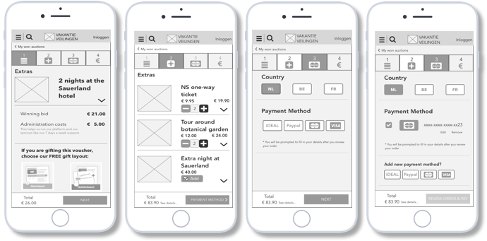
Step 6: Wireframing e.g. checkout flow for VakantieVeilingen.nl
Step 6 | Wireframe
Get your creative juices flowing and do a couple of jumping jacks...it's time to draw. Here you start to go further into the detailed interactions of the user with the system. Remember to practice empathy. Create prototypes. Define UX guidelines. Conduct moderated or unmoderated usability tests on the wireframes as well as the copy on things like buttons and menus ( I use Axure & Sketch). If within the clients budget, elicit the help of a lab that conducts more objective feedback like facial emotion recognition technologies or EEG's.
Re-wireframe.
Step 7: From UX to UI
Step 7 | Implement
Work with a UI designer to produce a design that affords for simple navigation. Together with developers co-create the ideal way to deliver iterations of designs. Taking the time to communicate as a team at this stage saves so much frustration (and sarcasm) at stand-ups. The feedback loop continues here while testing with users using interactive prototypes.
Step 8 Iterate till your times's up
The unsettling thing about UX is that you're never finished. If the project is alive then there are always improvements to be made.
Go back to Step 2 and get back to research, whether that means listening to customer care calls or analyzing a/b test results.


